
Colour Psychology in Interiors: Choosing Chair and Armchair Colours
Colour psychology · chairs & armchairs
Colour psychology in interiors: how to choose the colour for chairs and armchairs
Colour influences how calm, alert or cosy a room feels – no lab study needed. This guide translates common, easy-to-understand effects of blue, green, cognac, grey, black and warm earth tones into concrete decisions for dining chairs, reading chairs and lounge furniture from derStuhl.
You get a short style quiz with product recommendations, a printable checklist and examples with real models – including swivel armchairs such as DARI, the reading chair COLI and colourful dining chairs from the range.
What colour psychology can and can't do at home
Colour psychology in interiors describes tendencies, not guarantees. People react differently, and light, material and personal memories override any "rule". What remains are practical observations:
- Cool, clearer tones (blue, petrol, many greys) often look more orderly and suit concentration and longer periods of sitting.
- Warm earth tones (cognac, amber, mustard, olive) feel cosier and more inviting – typical for lounges and dinners.
- Highly saturated colours increase attention; muted variants of the same family are better suited to everyday life.
- Large surfaces (sofa, wall) shape the basic mood; chairs and armchairs add accents that are easier to change.
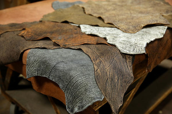
We don't quote invented percentages or studies here. Instead, we link these tendencies to models you can configure and order directly – complementing the unusual colour combinations from nature and the general colour trends in furniture.
Quiz: which chair and armchair colour suits your everyday life?
Four short questions. At the end you get a colour family and matching derStuhl models. The quiz doesn't store anything and is no substitute for advice – it simply structures your priorities.
1. What do you use the seat for most often?
2. What mood should the room convey?
3. What is your daylight like?
4. Which surface should carry colour?
Further down you will find the same logic as a printable checklist.
Colours and typical effects in a room

Blue and petrol – clarity
Blue is often associated with calm and overview. At the dining table it helps create a clear silhouette without being as dominant as pure red. Models: FOX, the cantilever chair BADSAAL, the REN armchair, turquoise SIGMA.
Green – balance
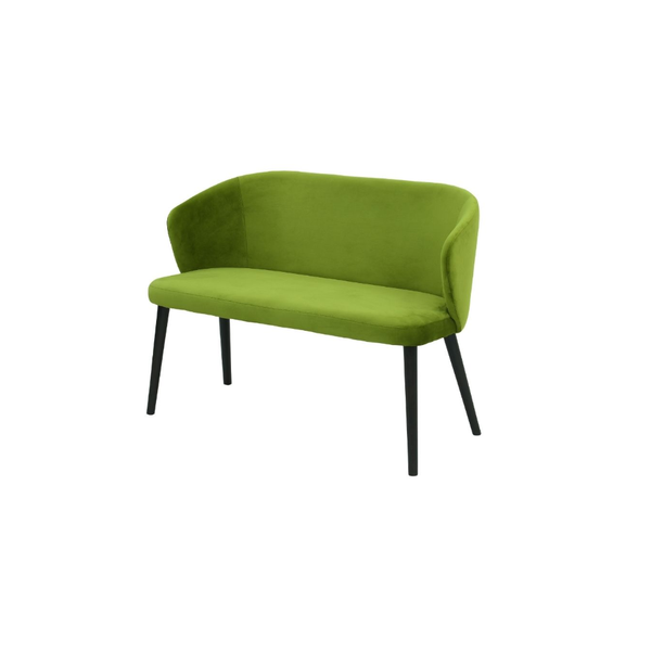
Green is close to plants and the outdoors, and many people find it balancing. Olive and pistachio are better suited to everyday life than neon. Dining chairs such as BRANDO, FEBE, IBIS or BRUNO from the sister article on nature palettes go well with it, as does the TALI armchair.
Cognac, amber, mustard – cosiness
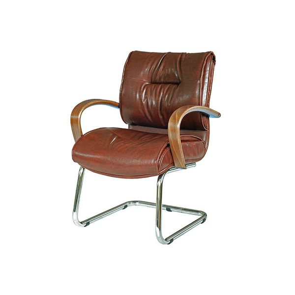
Warm browns and mustard are reminiscent of wood and evening light. They suit armchairs you linger in for longer: DARI A, and the chairs LAVA and JONY.
Grey and black – structure
Grey brings order, black adds definition. A grey reading chair such as COLI or a black DARI relaxing chair keeps colourful chairs in check. More on swivel mechanisms: swivel dining chairs.
Orange and burgundy – energy, in measured doses
Strong warm tones increase attention. Use them on individual pieces (ROBI, the SKY bar stool), not on all six seats (indicative).
| Colour | Typical tendency | Good places to use it | Example |
|---|---|---|---|
| Blue / petrol | Clear, calm | Eating, reading | FOX, BADSAAL, REN, SIGMA |
| Green | Balancing | Kitchen-diner | see palette guide |
| Cognac / mustard | Warm, inviting | Lounge, dinner | DARI A, LAVA, JONY |
| Grey / black | Structure | Base, contrast | COLI, DARI |
| Orange / burgundy | Invigorating | Accent chair | ROBI, SKY Bar |
Many dining rooms already have a fixed anchor: the tabletop and the floor. A warm oak tone often goes with cognac, mustard or muted green; a cool grey floor makes blue, petrol and clear grey look calmer. So check the planned chair or armchair colour next to these surfaces first, not just against the wall.
Chair, armchair, sofa: where colour has the strongest effect
Not every surface carries colour in the same way. A dining chair appears six times over if you order a whole group (indicative); an armchair is a standalone piece; a sofa is a large area of colour.
- Dining chair: colour multiplies. For strong tones, two accent chairs at the ends are often enough, with the rest kept calmer – or you deliberately choose a single family (e.g. all green in two shades).
- Armchair: ideal for cognac, black leather or strong blue, because you control the effect locally. Swivel armchairs such as DARI / DARI A combine comfort with orientation in the room.
- Sofa: usually remains the base. A calm YAN sofa plus colourful chairs is often more balanced than a loud sofa plus loud chairs.
- Bar stool: at the island they are visible from a distance – red/burgundy (SKY) or light blue (CAPRICE) mark the transition to the kitchen.
Matching collections: Dining chairs, Armchairs, Sofas, Bar stools. If you want beige as a calm base: Beige dining chairs. Armrests change the silhouette more than colour alone – see Dining armchairs.
Printable checklist: choosing the colour for chairs and armchairs
Tick off the points before you order. "Print checklist" opens your browser's dialogue – save as a PDF or print on paper.
The checklist stays locally in your browser; no data is sent.
Product examples by desired effect
Calm & clear


Warm & cosy


Structure & contrast


Everyday life: light, rented flats and flexible accents
In many homes, north-facing windows, period stucco and rented walls that have to stay neutral also play a part. Then it is wiser to control colour through furniture rather than large wall surfaces:
- Rented flat: chairs and armchairs are reversible. A cognac armchair or two petrol chairs change the room without renovation.
- Open-plan layout: one colour family should connect kitchen, dining and lounge – e.g. navy on the cantilever chair and the same blue on the reading chair, or mustard on the chair and cognac on the armchair.
- Home office corner: for concentration, rather blue/grey on the work chair; warm tones more in the break lounge. Tips on work chairs: Desk chair.
- Evening use: warm white lighting makes cognac and burgundy look natural; cool white spots can make blue appear distinctly cool.
Material psychology – short and honest
Besides colour, the surface influences perception: leather looks clearer and more "architectural", velvet and bouclé softer and more inviting, woven fabrics suitable for everyday use. The same colour in leather and fabric can feel like two different palettes. That is why it is worth looking at the upholstery options for DARI, COLI, REN, ROBI or SIGMA before deciding on the thumbnail alone.
Mistakes that ruin the effect
- Six loudly different chairs (indicative) without a common leg or fabric motif
- Wall, sofa and chairs in the same saturation
- Deciding only by screen colour without checking the daylight in your own room
- Mixing seat heights that jump visually – then even a calm palette looks restless
If you plan palettes rather than individual effects, combine this guide with the article on colour combinations from nature. For beige as a calm base, Beige dining chairs remains the right starting point; for sprung chairs, Cantilever chair.
FAQ: colour psychology and choosing furniture
Is there a "right" colour for the dining room?
No. There are suitable combinations for light, use and taste. Blue and green are often considered suitable for everyday use; cognac and mustard inviting; orange and burgundy as accents.
Do I have to follow scientific studies?
For your home, understandable tendencies and a test on site are enough: place fabric samples or product photos in the room and observe them in the morning and evening.
How many coloured chairs make sense?
With strong tones, often two accents plus calmer neighbours (indicative). With muted greens or blues, the whole group can be uniform.
Leather or fabric – which changes the effect more?
Leather reflects light and often looks clearer/cooler in black, warmer in cognac. Fabric (including bouclé) diffuses light and looks softer. Care differences can be found on each product page.
Which guides help next?
Combining a dining table and chairs, Cantilever chairs, Desk chair and the Armchairs and Tables collections.
Next step
Use the quiz and checklist, open two or three product pages and compare dimensions and upholstery options. If you plan palettes rather than individual effects, read the guide to unusual colour combinations from nature.